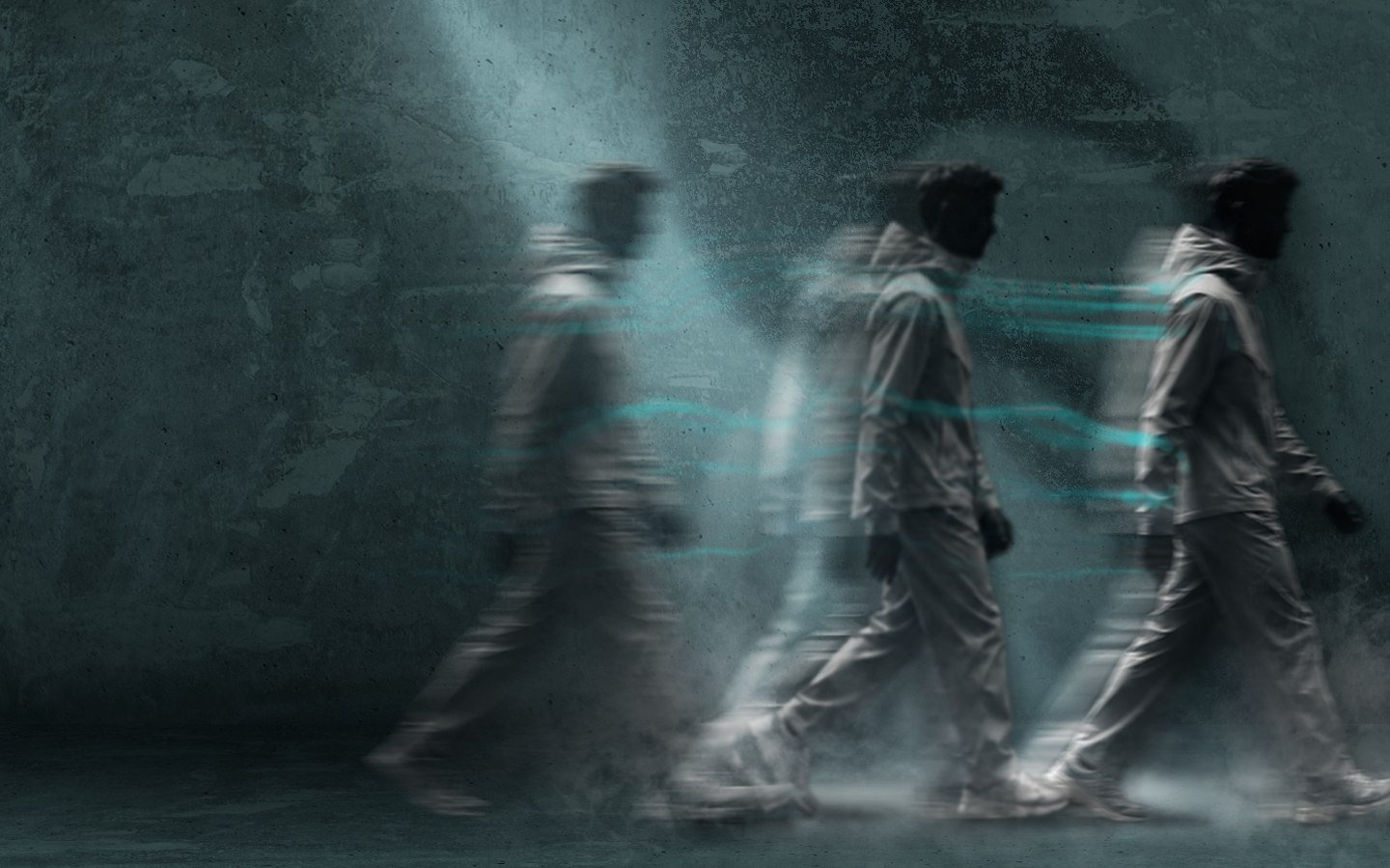
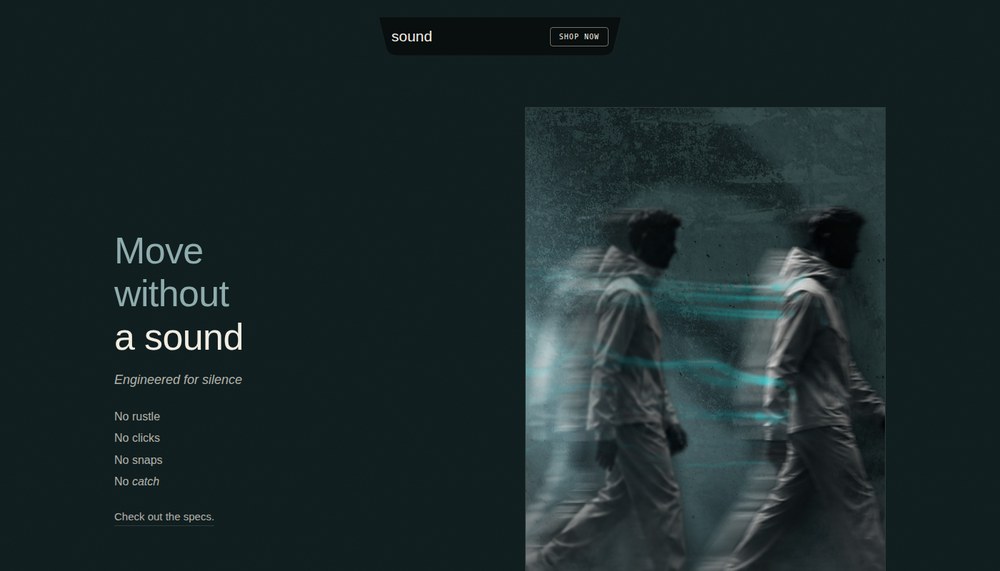
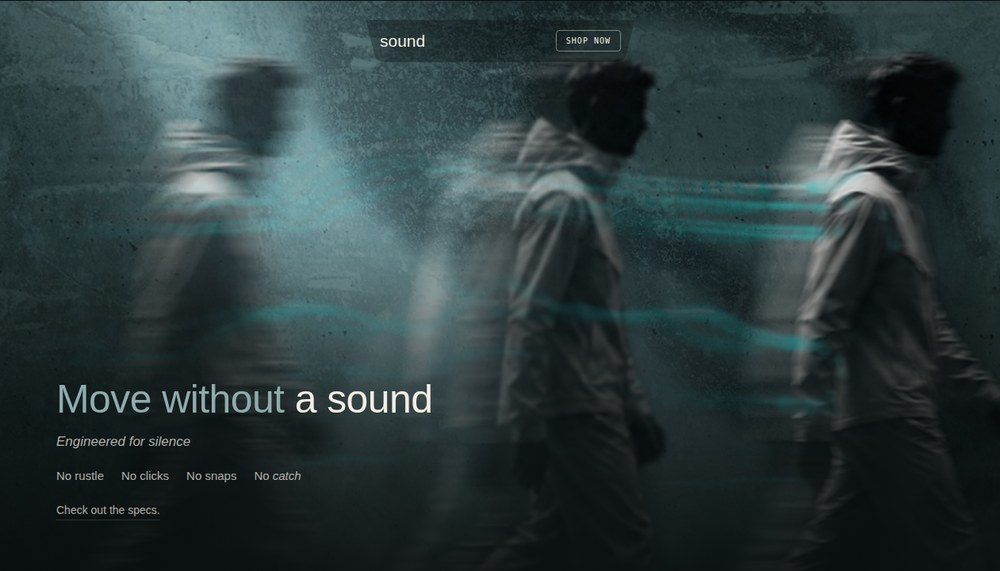
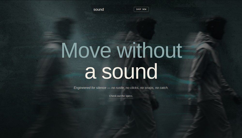
CUSCO's biggest build yet — a full brand system done end to end: name, logo, product design, ad campaign, and a complete website, all designed by me. The concept is a "not loud" design language — minimalist, dark tealish-gray paired with a warm cream, no big branding — bridged with an "engineered for silence" construction story that turns the calm look into something with a reason behind it, split across two lines: Quiet at Rest (loungewear) and Quiet in Motion, the flagship windbreaker. The launch landed too — the Instagram page pulled in over 10,000 views within its first 24 hours live.
The process ↓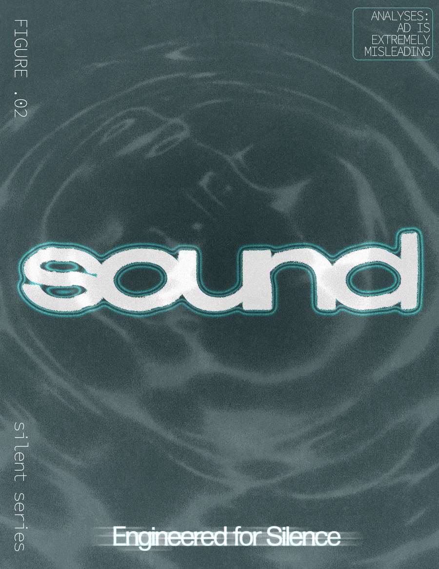
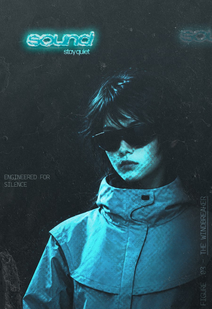
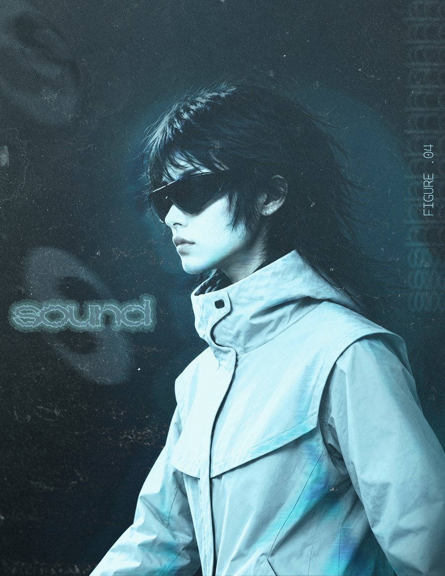
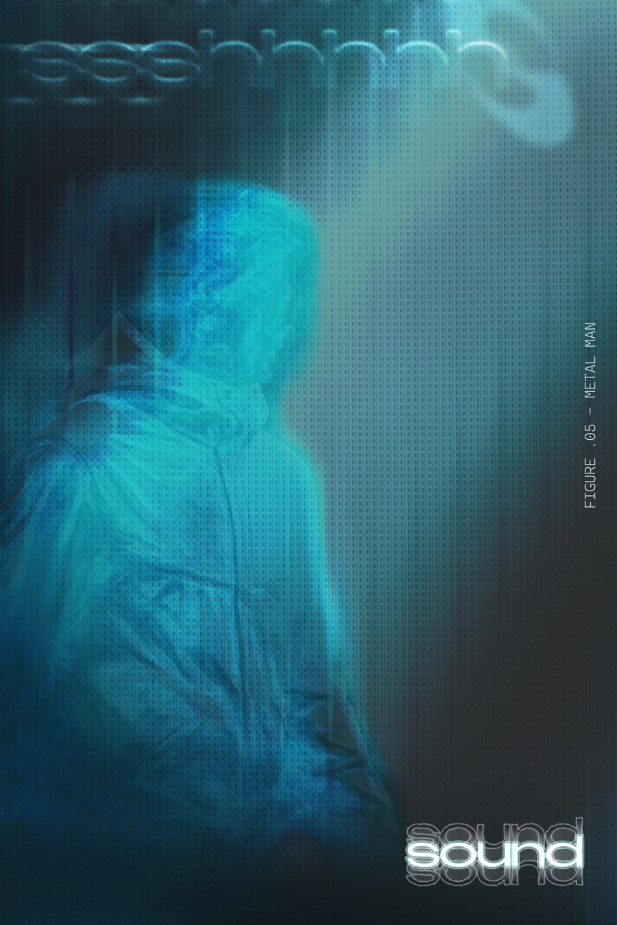
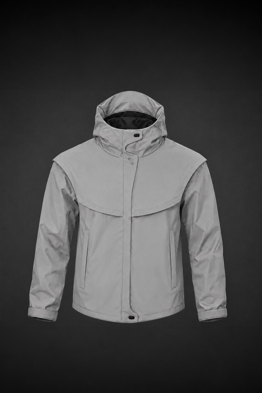
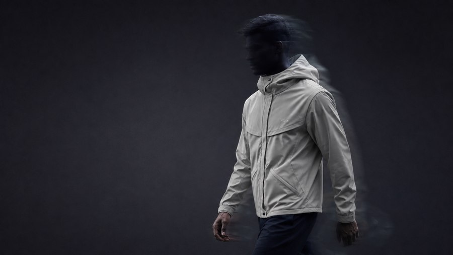
The Windbreaker is the flagship — Quiet in Motion — built around a magnetic storm shield and clasps that replace the usual rustling zippers and snaps.
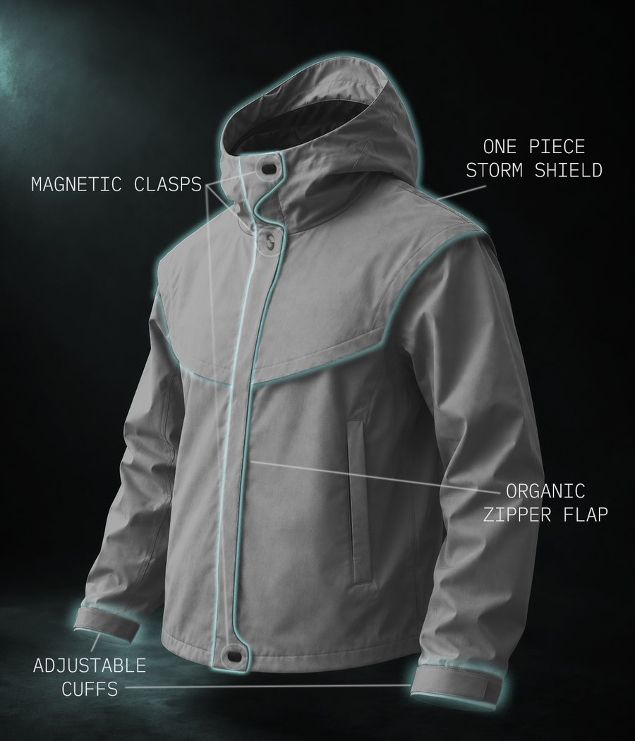
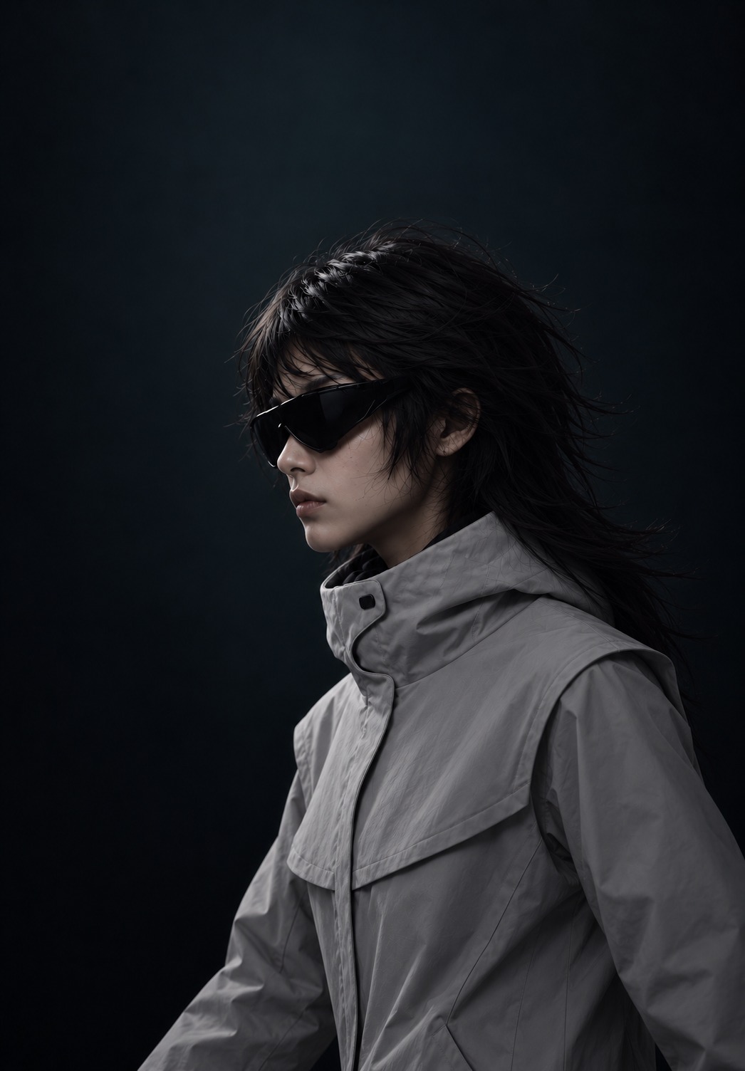
Eight shots across the full line — one windbreaker, three loungewear pieces — fronts on top, backs underneath.
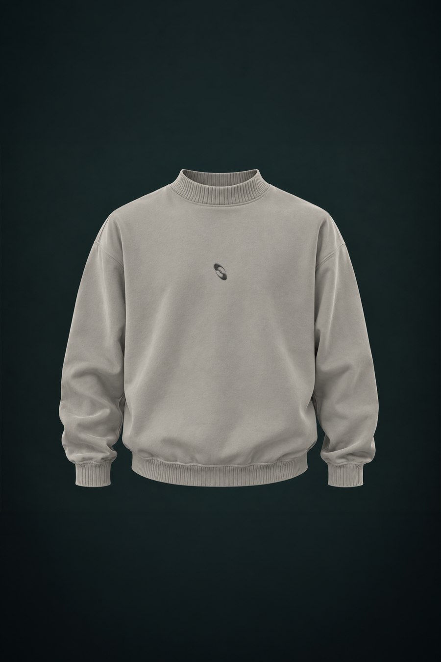
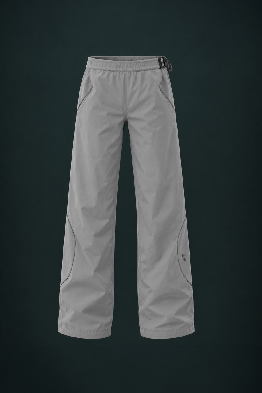
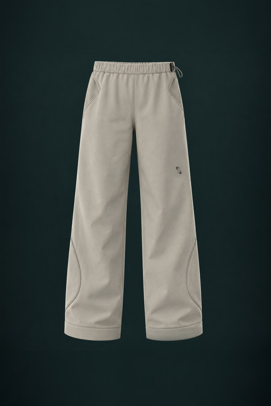
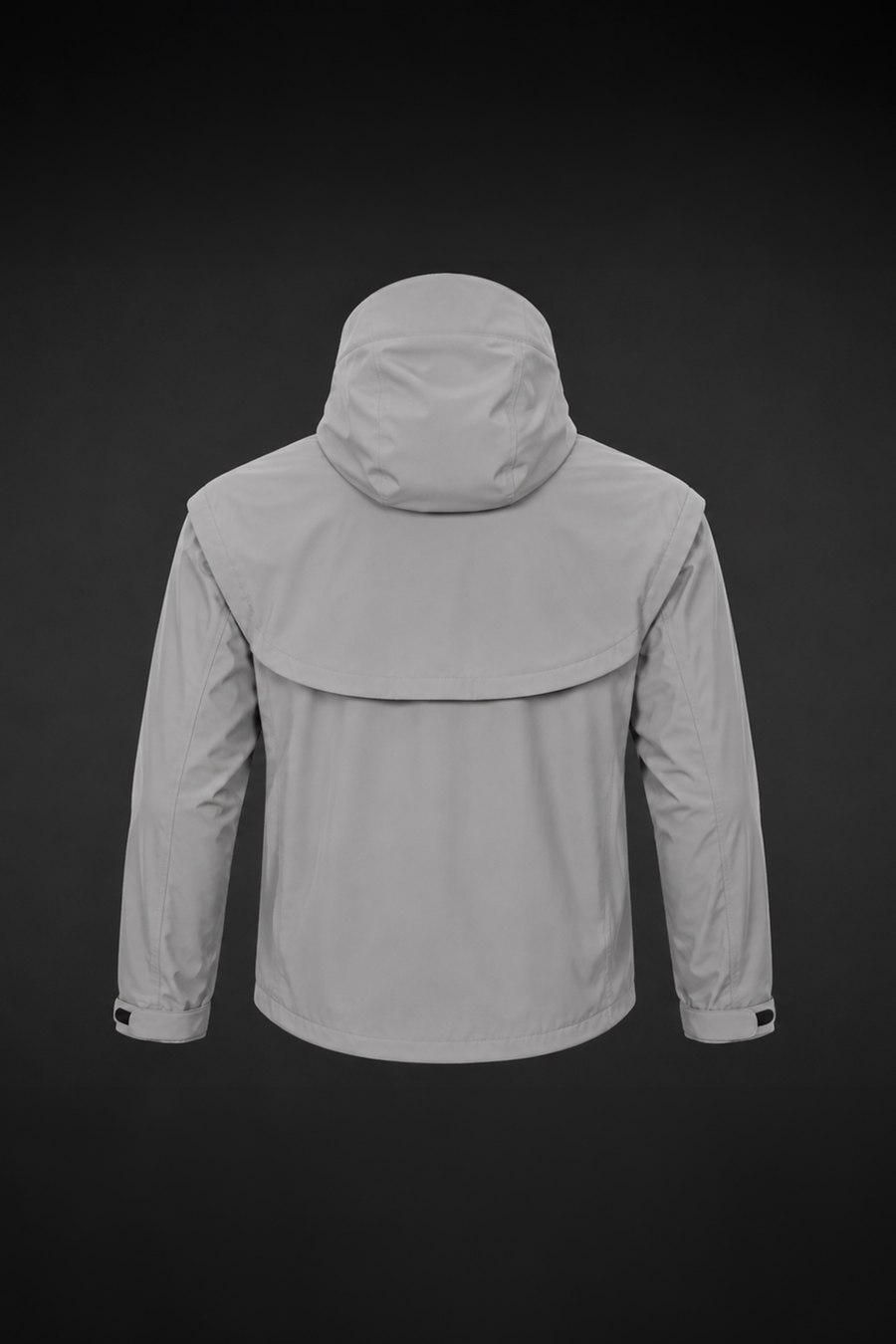
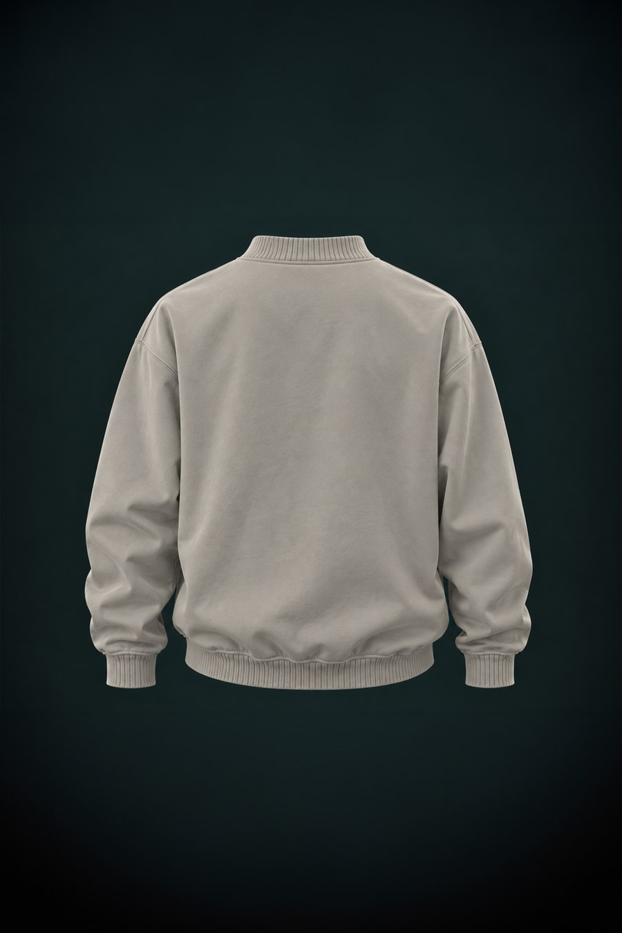
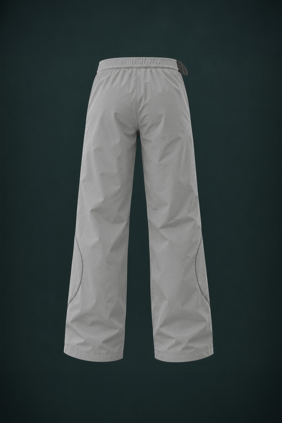
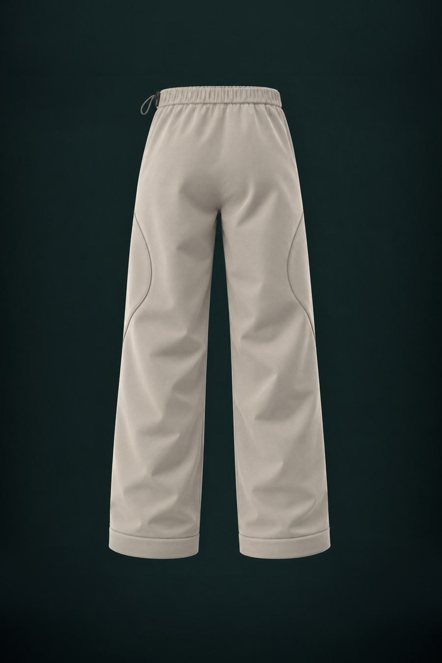
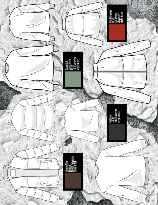
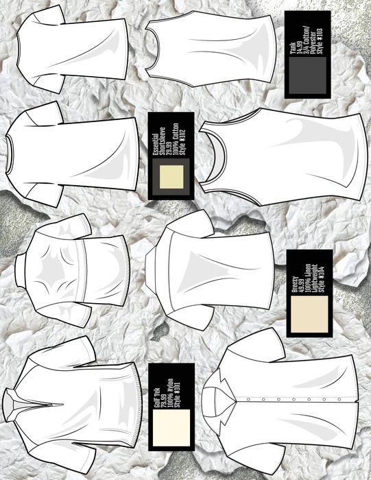
The same four pieces, one step earlier — construction notes and all.
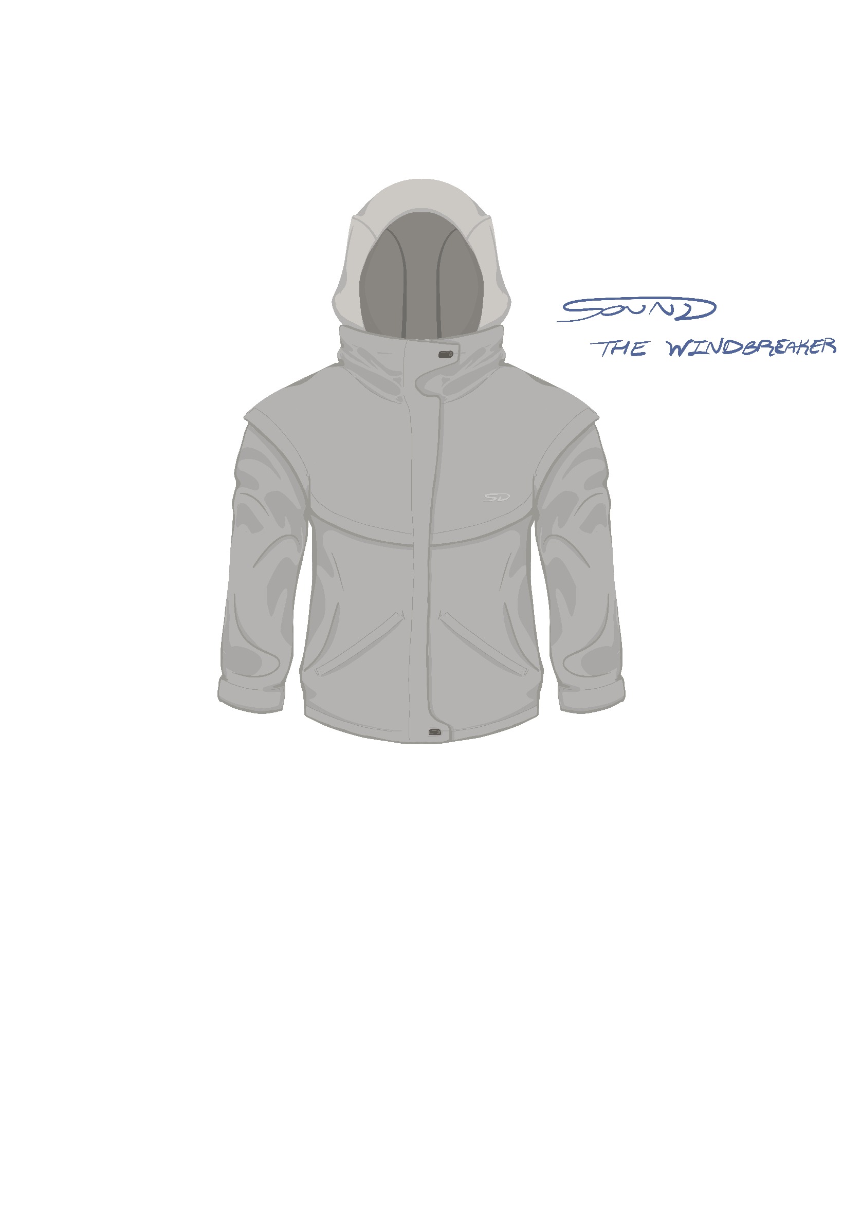
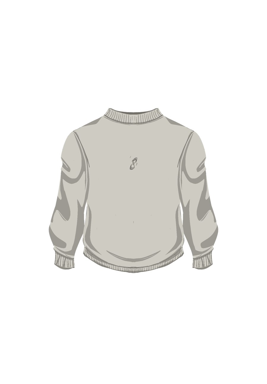
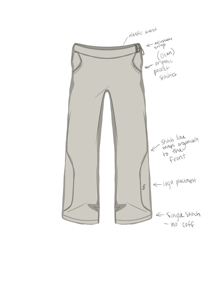
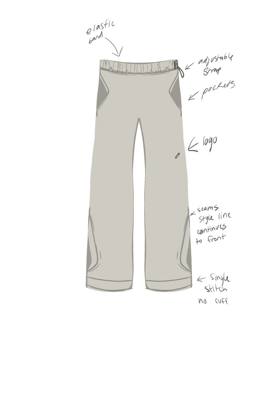
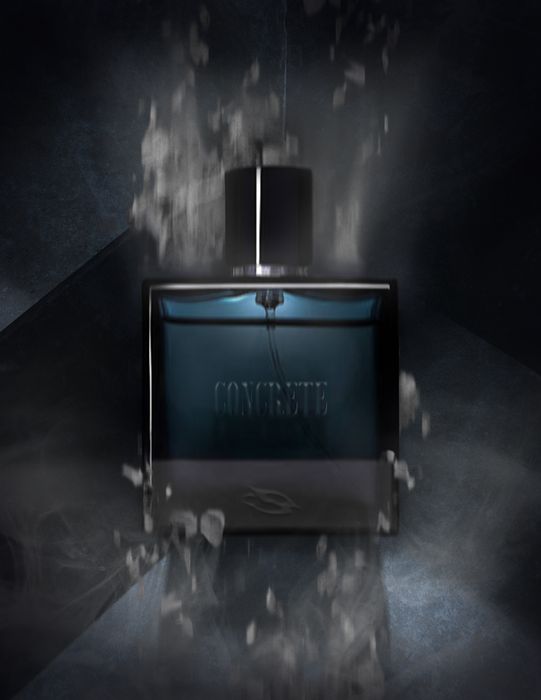
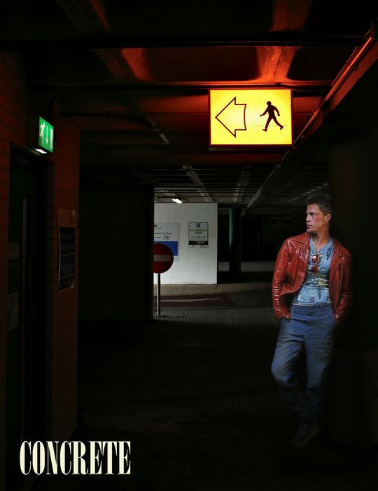
Early exploration that didn't make the final cut — different lighting, different framing, before the hero settled into the version on the site now.
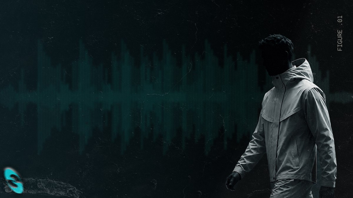

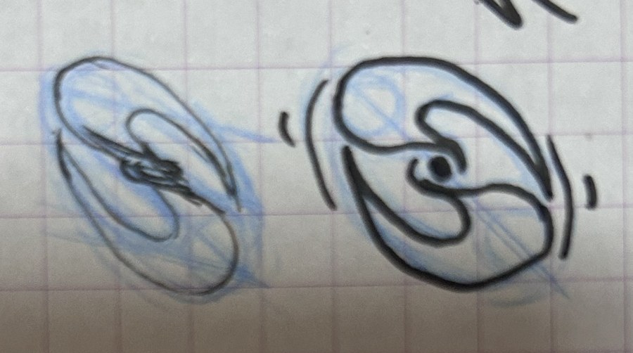
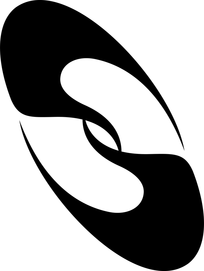
The final mark is a single continuous "S" — two mirrored halves reading as one line, drawn and redrawn until it locked.
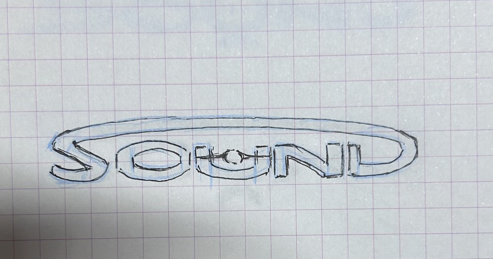
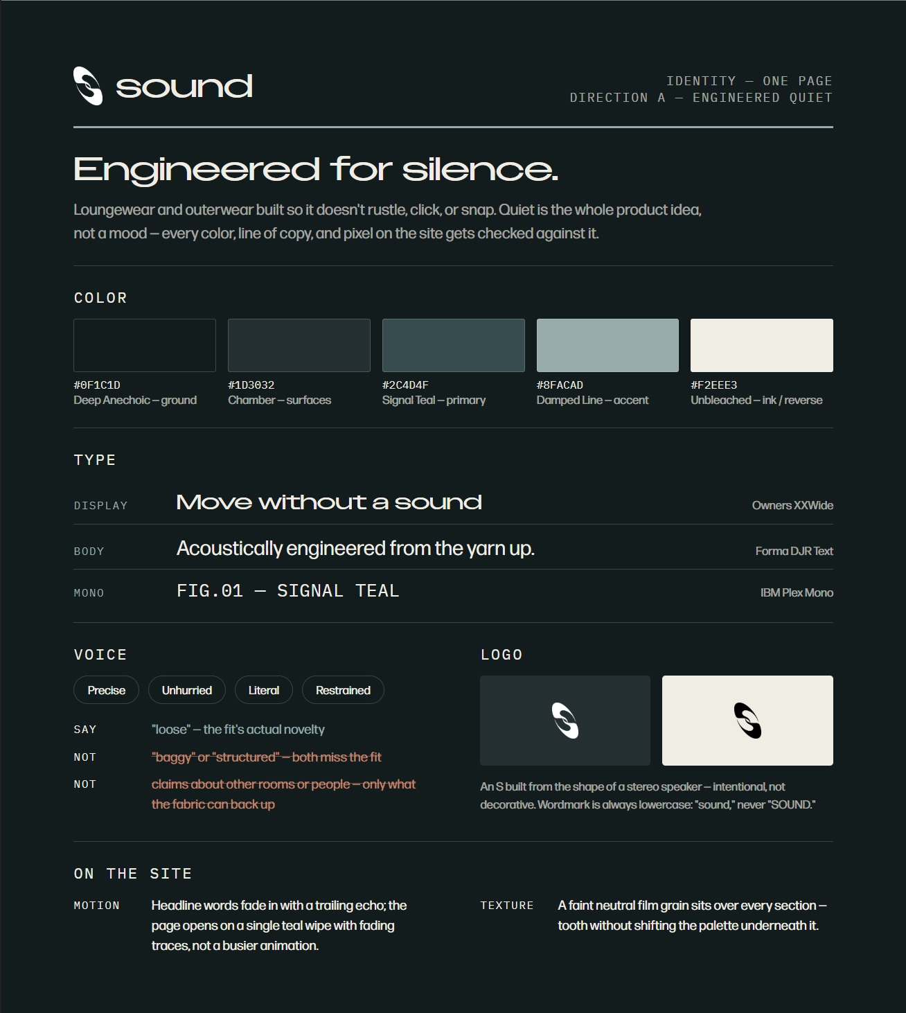
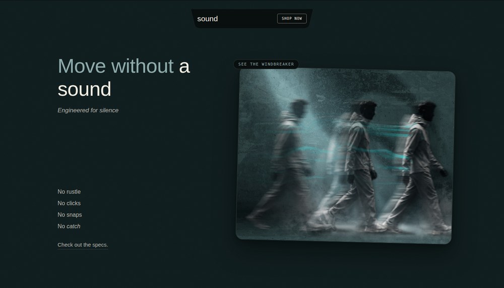
The brand runs on two ideas at once — a look and a mechanism — and neither one works alone.
There's a lot more to this than what fits here.
Read the full process write-up →