Selected Work

Work

A selection of work I've done including commission, organizational, and non-profit projects.

Mentorship Program · Social Ads
Flipstate

Flipstate is a consumer wellness brand. Through their mentorship program — which gives undergraduates early, standardized industry experience — I work closely with the founder to brainstorm and develop performance-focused ads for commercial and social use that capture the brand's identity.

The Process

Three ads, one question each time: how do you show what the product actually does without just shooting a pill bottle.

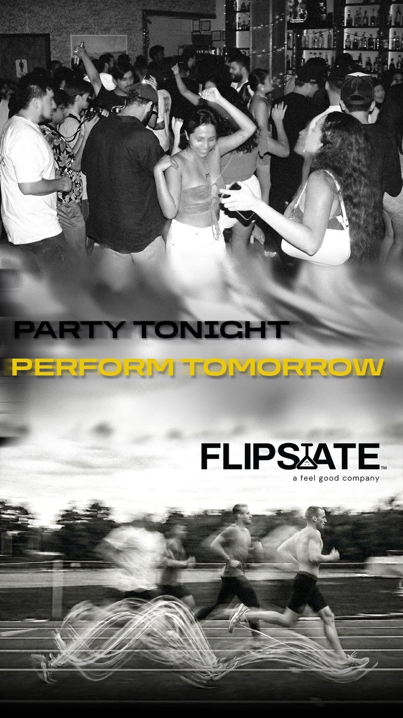
How do you connect a night out to someone's athletic performance?
A blurred transition down the middle — party on one side, performance on the other — landing on the logo. The payoff: no hangover, perform like it's any other day.
How do you play off the name "Chill" without saying it outright?
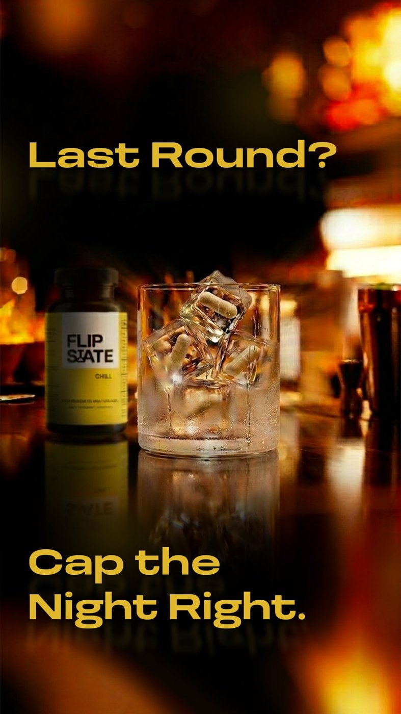
There's already a phrase for it — take a chill pill. So I made one, literally: pills frozen into ice cubes, dropped in a shot glass at the bar, bottle sitting in the background for context. Kept the mood mysterious and cozy, closer to a Got Milk? ad than a supplement ad.
How do you show the general benefits without overcomplicating the image?
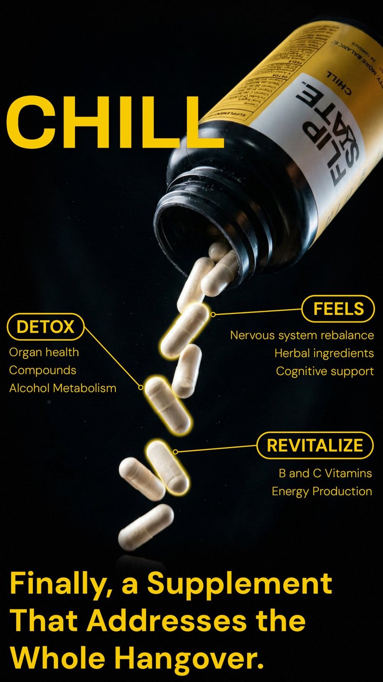
Pills falling, a few glowing to catch the eye, text bubbles calling out each benefit. Kept it simple on purpose.
Flipstate ad 1
Flipstate ad 2
Flipstate ad 3
Student Organization · Apparel · Identity
Austin Bodybuilding

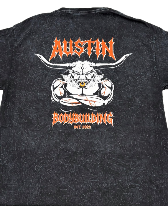
Austin Bodybuilding is a student organization. As part of the media committee, I create event logos, stickers, and social media graphics — most notably the 2025–2026 ABB shirt, worn by 150+ members to represent the organization. The process is shown below.

Collegiate Classic Logo

Doubled as the event's official logo — it had to read Texas while still fitting ABB's existing look.

What screams Texas without going generic?
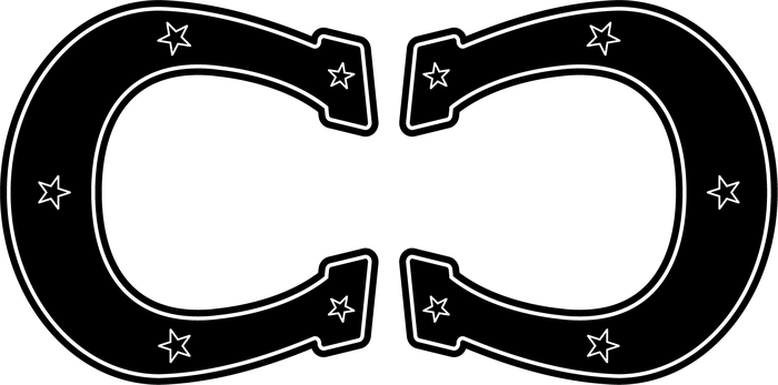
A horseshoe — but slicked up: modern, a little edgy, some stars worked in, kept classy since this was standing in for a professional event.
Two horseshoes side by side looked off — now what?
Flip one so they mirror each other. Paired with the event name, people read it instantly. It passed and became the official logo.
CC Logo — final
CC Logo — runner-up version
Shirts and Stickers

ABB's identity is already cool, edgy, modern — 2000s streetwear. The shirt needed to carry that.

What ties the design back to the university?
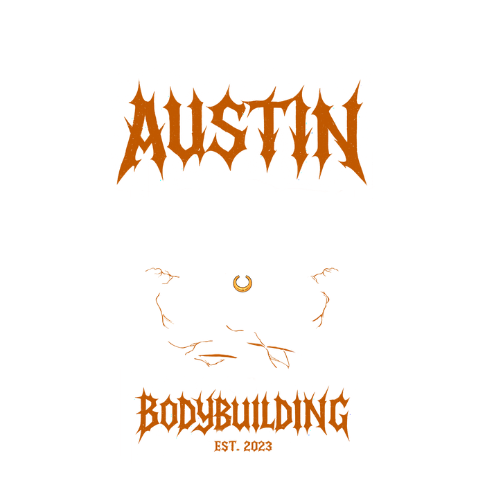
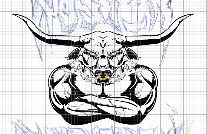
A longhorn — not just any longhorn, a buff one. Burnt-orange veins popping to show we bleed burnt orange, smoke puffing from the nose for attitude, a nose ring in for edge.
Why go that hard on the concept?
Bodybuilding takes real discipline — a group of people who lift heavy and stay consistent, no easy days. The design had to feel just as tough.
What's a sticker shape that actually fits the brand?
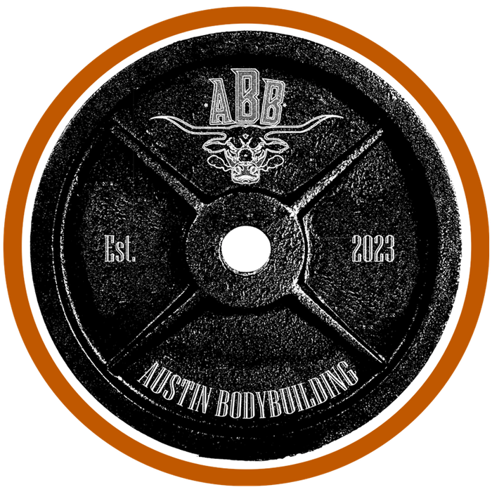
A 45-pound weight plate, branded with ABB's logo — no better fit for a bodybuilding org.
ABB shirt design
ABB shirt mockup
ABB shirt concept
ABB sticker
ABB word logo
Social

Two graphics, two different starting points.

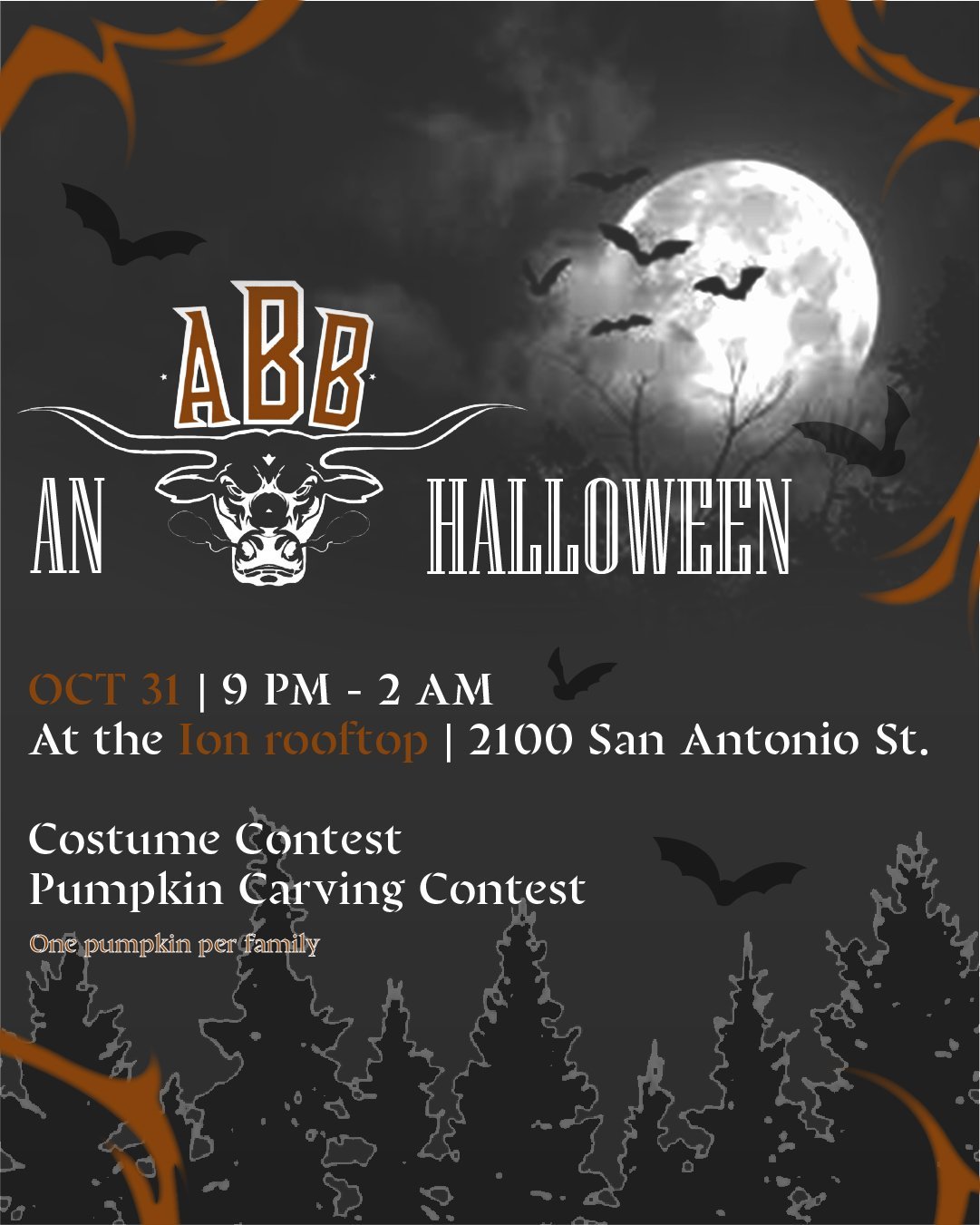
How do you make a Halloween graphic feel Austin?
Bats. Straightforward, but it works.
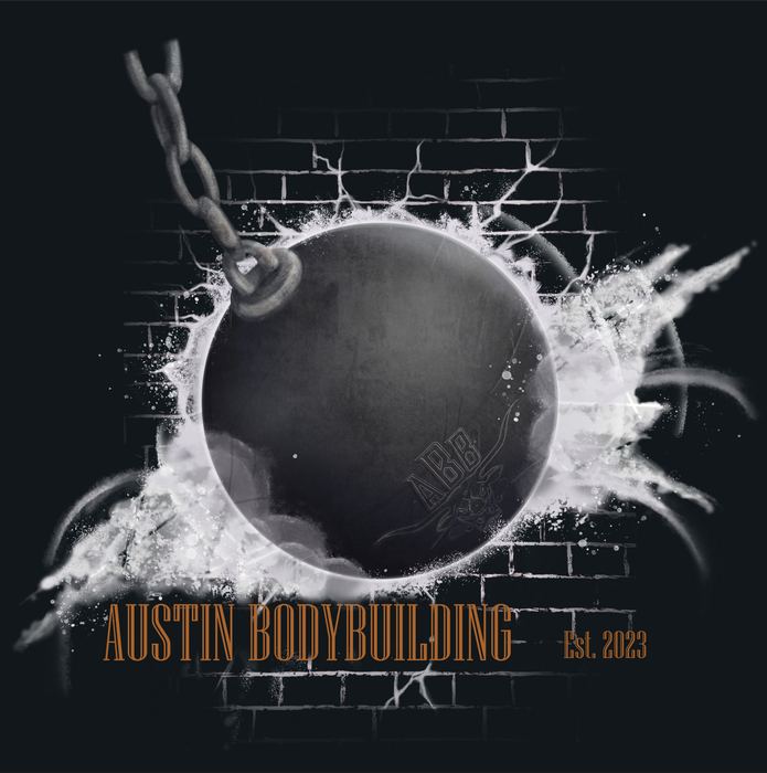
How does a wrecking ball fit a bodybuilding brand?
It's heavy and it hits hard — same energy as lifting. Started as a shirt concept, ended up working better as a social post.
ABB Halloween event graphic
ABB Wrecking Ball graphic
Employer · Social Content
The Drag Audio and Production House

The Drag Audio and Production House is a podcast studio primarily operated by University of Texas students. I've designed 10+ iterative social media packages for podcasts with 1,000+ monthly listeners — primarily Forsaken and The Drag: Stories — along with several promotional social flyers for seasonal use.

Forsaken

The first project where I stuck strictly to brand guidelines — a podcast covering social injustice, and the templates had to feel like an extension of the cover art, not just slides with text on them.

What from the cover art can carry across every template?
The wall — broken into sections by beams — became the base for every slide, with the cover's lighting projected onto it to highlight each episode's title.
How do you keep a second version from feeling like a repeat?
Kept the wall but pushed it back and opened things up with blues and purples from the sky — less claustrophobic. Lighting still highlights the text, and each episode gets its own background details — flags, posters, newspaper clippings — tied to what it actually covers.
The Drag: Stories

Stories covers such a wide range of topics that one rigid template wouldn't have worked — so I was given full creative freedom instead.

With no guardrails, where do you even start?
Lean into Austin and UT. Austin's the music capital of the world, so one direction went music-themed and kept it light.
What's a second direction that still feels tied to school?
A scrapbook — one that looks still in progress, built from polaroids representing each episode or piece of content covered.
The Drag: Stories — Creative
The Drag: Stories — Travel
The Drag: Stories — Vinyl
Miscellaneous
For a Friend · Apparel
KyStrong

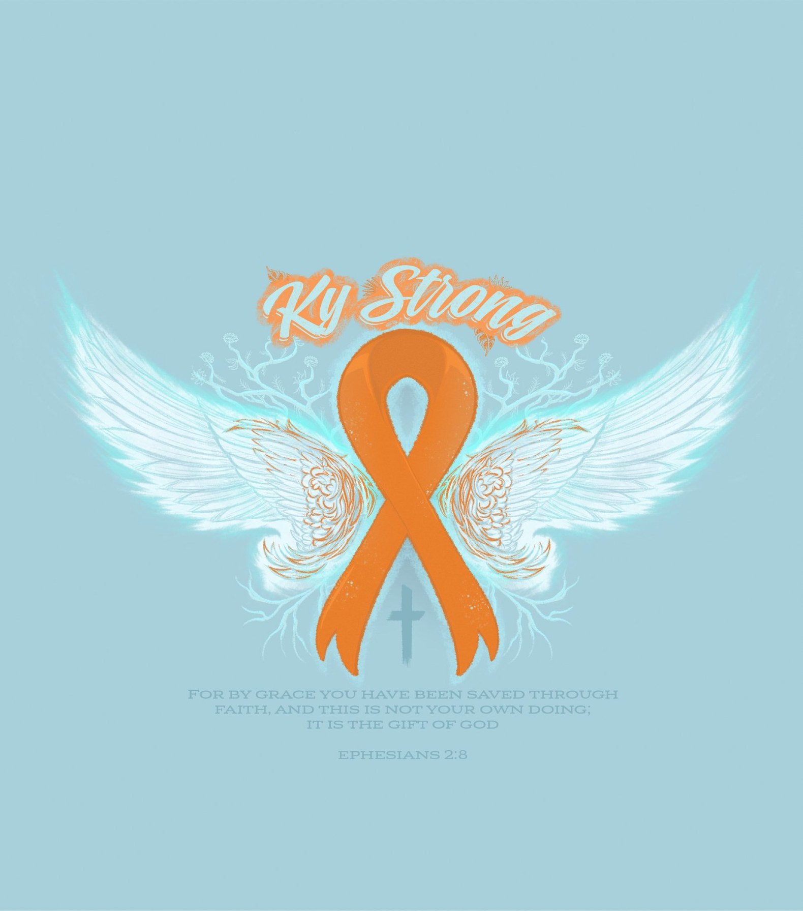
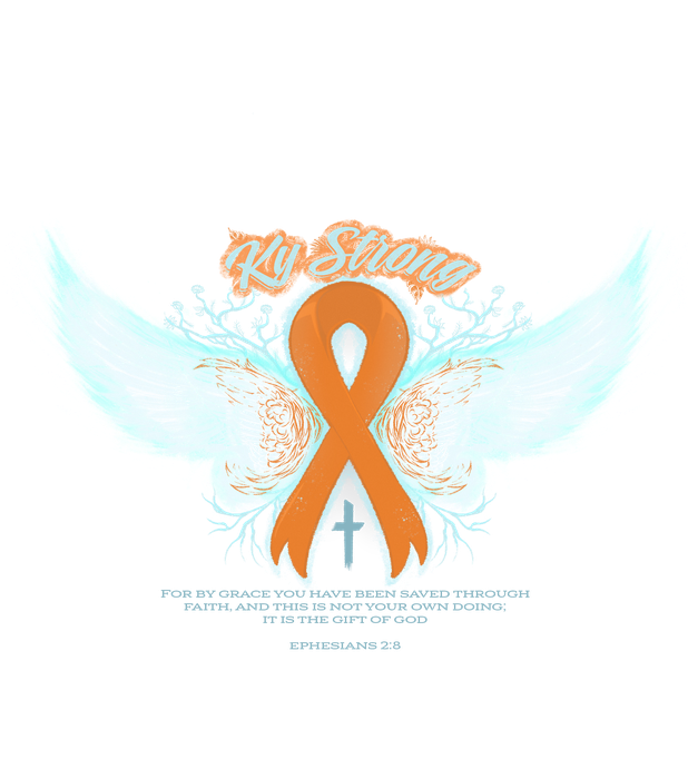
KyStrong is an awareness campaign for a dear friend. I designed the tee shirt for spreading awareness in support of them — the process is shown below, including the back-up design.

The Process

I'm not exactly the target audience for something girly, so the challenge was making it feel neutral without losing that softness.

What symbol reads as both girly and universal?
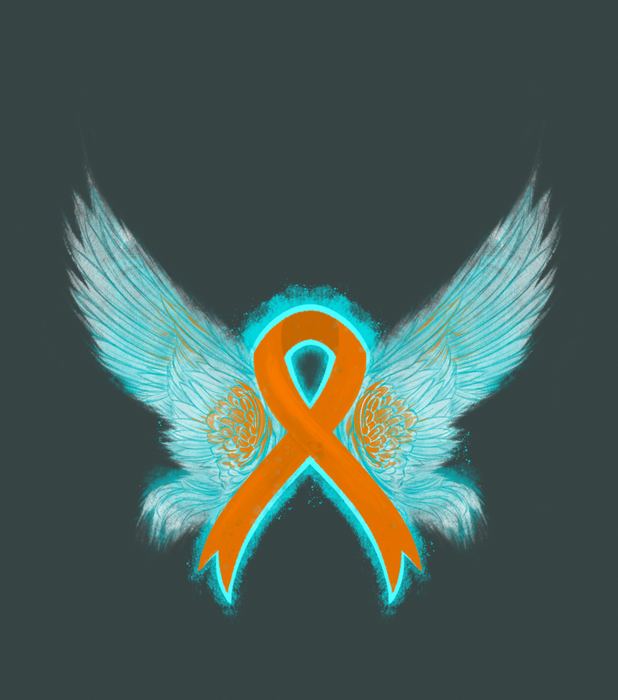
Wings — everyone likes them, and they carry a sense of freedom. They erupt from the ribbon's center crossing point.
How do you keep the rest light without overdoing it?
Soft, girly fonts, subtle floral touches like baby's breath — nothing loud.
What went wrong with the back-up design?
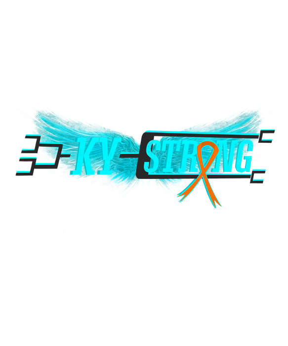
Leaned into Ky's love of sports and tried a bracket-style layout — but it read as too masculine, so it didn't make the cut.
KyStrong — finished piece
Process
KyStrong — process 1, white background exploration
KyStrong — process 2, teal glow refinement
KyStrong — back-up design concept